FunctionsRates of Change
Throughout history, bacteria and viruses have plagued populations ranging in size from villages to entire civilisations. We see cycles of infectious diseases such as small pox, black death, salmonella, yellow fever, flu, polio, AIDS, ebola, Zika, and COVID-19 change the course of history.
Math can help us understand the scale and impact of disease outbreaks. Today we will be focusing on the
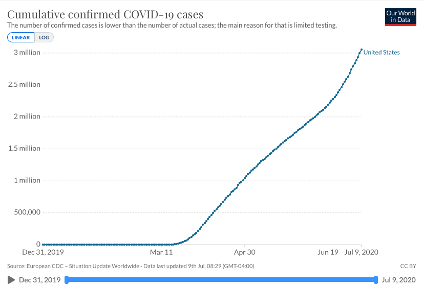
The table to the right shows the cumulative confirmed cases as a function of time. Recall that this wording means that time is the
###fixme: hide until blank filled and cumulative confirmed cases is the output.
This word cumulative means current total over all time. That means this number only goes up, even if the daily confirmed cases begins to decrease. To get a more accurate picture of what's going on, we can calculate the number of new cases every day.
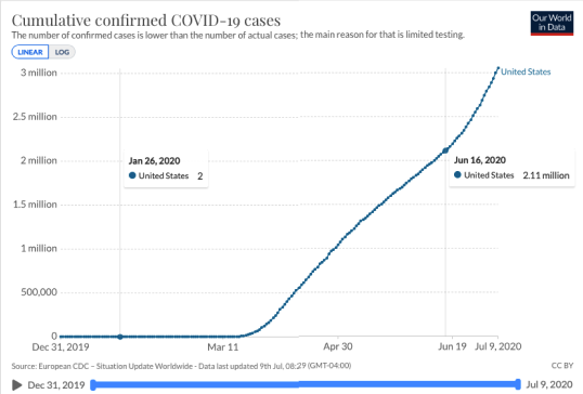
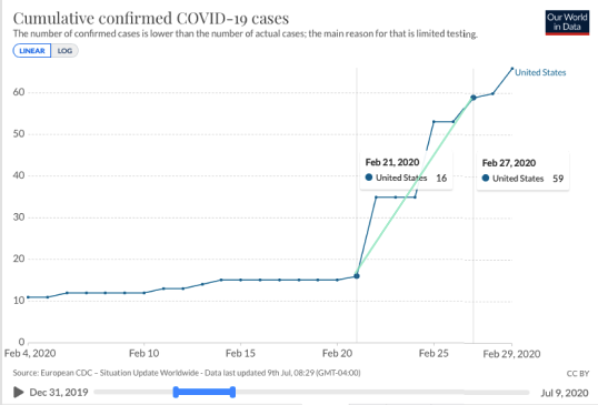
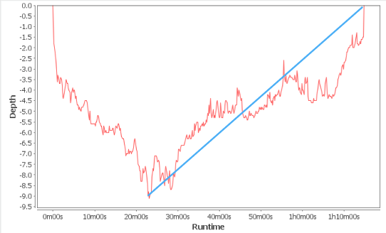
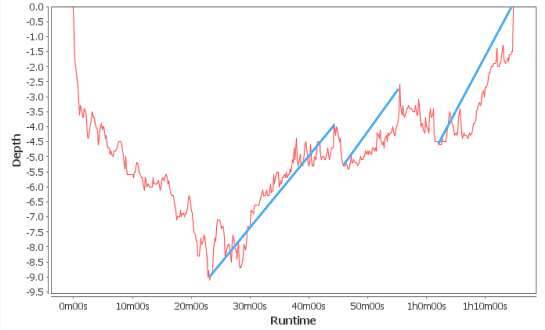
For example, we can place points on the graph to the right on January 26 and June 12. The slope of the line running through these two points is called
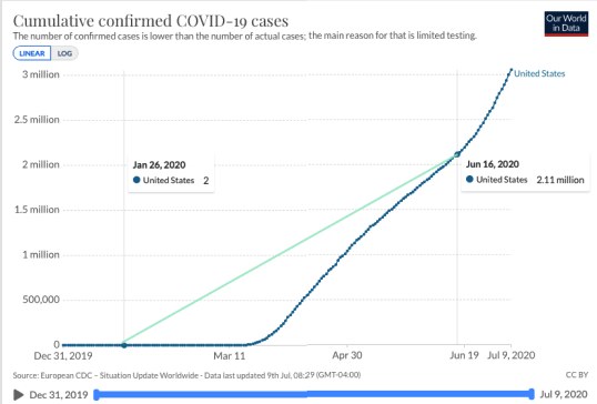
This line estimates the confirmed cases have been increasing at a rate of over
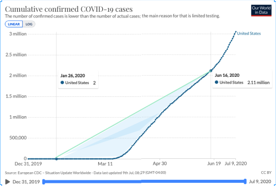
Now, we can see that this line doesn't do a great job of telling the story of how the daily case count changed over time. The area in blue shows the distance between the average rate of change and the actual graph.
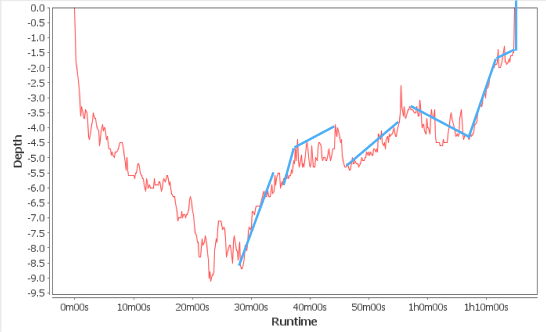
Let's see if there is a way to make the average rate of change better estimate the actual daily change.
When we zoom in on a smaller date range, we see that the cumulative case count makes huge jumps on some days. The average rate of change can smooth these jumps.
This can be especially helpful for data sets that have huge outliers. Outliers are data that are substantially different than other data points. In statistics, we recognise that outliers can pull averages and standard deviations in their direction.
The same thing can happen here with this data. Days where there is particularly high or low increase rates can make the graph jagged. Average rates of change can help smooth the graph and perhaps our understanding of what is going on during a specific interval. The trick is adjusting the interval to the appropriate size. We will looks this more in statistics.
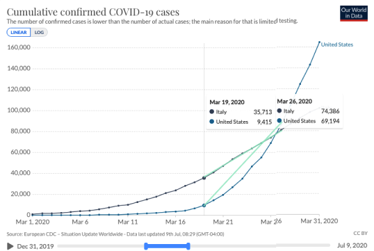
Average rate of change can also give a way to compare change among different countries. Let's compare cumulative confirmed cases in the USA and Italy in the month of March 2020.
Students can use crosshairs to read data from the graphs. They can also draw lines between interesting point (as noted in the text) to visualize rate of change.
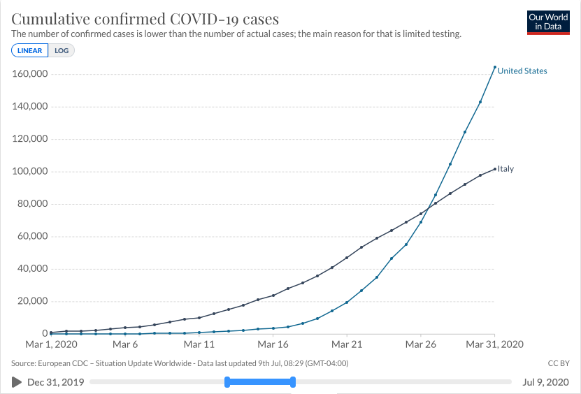
We can see that Italy had a higher cumulative case count until March
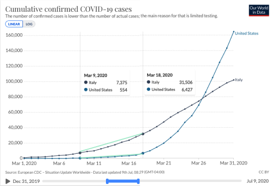
When we look at the average rates of change for the two countries between March 9 and March 18, we see that Italy's daily case count is rising about
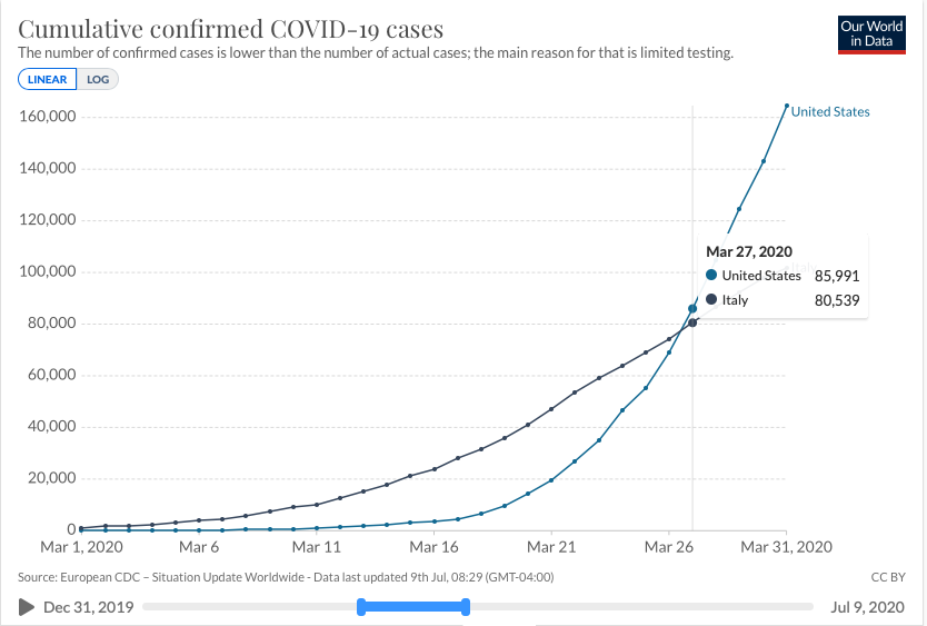
It makes sense that the country with the highest case count would be seeing a higher number of cases per day. But something interesting happens between March 19 and 26.
During this week, the total case count in the USA was still lower than Italy's. However, the USA's case count was increasing faster that Italy's. The USA's daily case count was growing about
While it may seem opposite of our expectations, this odd relationship between average rates of change and total count is the only way that the USA's total case count surpasses Italy's.
As we have seen, average rates of change can be helpful for understanding statistical data. They can also help us understand objects in motion. Let's take a look at rates of change in SCUBA diving and space shuttle missions.
SCUBA Diving

Scuba diving (self-contained underwater breathing apparatus) is a XXX dollar industry globally. People travel to destinations to dive in new and different waters. With this recreation XXX industry growing, diver education and safety is a high priority for organisations like PADI and DAN. The pressure of the water on the human body is higher than we are used to at ground level in the atmosphere. And, those pressure increase the deeper a diver travels.
Stock Video of Group of Divers During Safety Stop at Adobe Stock
Nice 14s video of safety stop
The laws of gasses and pressures are such that the air we breathe, even with scuba gear, can change XXX and XXX as the water pressure increases. This compression needs to reverse as the pressure decreases when a diver ascends to the water's surface. If a diver resurfaces too quickly, the gases in their cells won't have time to XXX - creating bubbles in tissues and joints. This can lead to decompression illness. To prevent this, divers pay close attention to the rate at which they are ascending. Yep, rate. The idea is to ascend slower than 10-15 meters per minute.
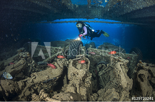
Lots of great options in Adobe Stock with search: SS Thistlegorm.
The S.S. Thistlegorm is one of the top 10 wreck diving sites in the world. This British Merchant Navy ship sank on 6 October, 1941 during the Second World War. Jacques Cousteau discovered her wreck site in the early 1950s.
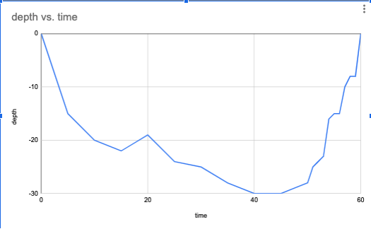
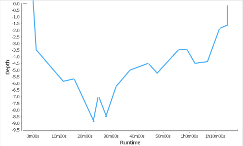
This is the depth profile of a typical dive to the SS Thistlegorm. We call a graph like this one a position function. The y-values tell us where the diver is in relation to the the surface of the water, while the x-axis tell us when they are at any given position.
The diver's maximum depth was about
The above is a mock-up of a more realistic profile. Combine this with the noise elements of the image below.

Design cards for the words below. Students drag to above graph.
x-intercept
maximum
x-intercept
increasing
increasing
increasing
decreasing
decreasing
decreasing
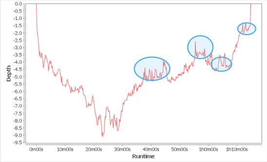
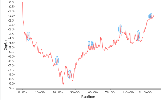
Notice the graph has a bunch of peaks and valleys. These seemingly random highs and lows are called "noise". Many different factors can contribute to data like this. GPS readings often have noise because of lapses in connection between the diver's computer and the satellites.
We can use average rates of change to smooth out this graph just like we did in the COVID-19 graph above.
The above is a mock-up of a more realistic profile. Combine this with the noise elements of the image below.
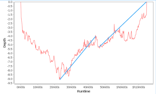
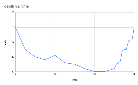
We see that the diver's position function more or less increases from (45, -30) to (
The above is a mock-up of a more realistic profile. Combine this with the noise elements of the image below.
Notice, though, that the rate of increase is not constant. This diver seems to have taken breaks along the way.
This begs the question - did the diver ever exceed the recommended ascent rate?
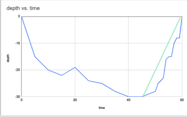
To answer this question, we can [place points](target:1_point, target:2_point) on the graph indicating the segments we want to isolate. The line running through two of these two points is called a
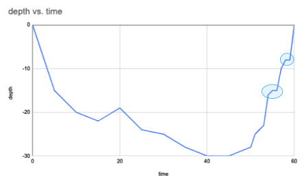
Use the slider to see how changing the number of averages affects the relative average rates of change.
Approximate states for slider. Design similar for the "depth vs. time" data. Images are mock-ups based on old data.
The more lines representing average rates of change there are, the secant lines gets
Multiple select
The slope of the secant line gets closer to the rate of change on the cumulative cases graph between the intersection points.
The slope of the secant line gets farther from the rate of change on the cumulative cases graph between the intersection points.
Distance between the secant line and the cumulative cases graph increases.
Distance between the secant line and the cumulative cases graph decreases.
Slope of the secant line changes.
Design similar for the "depth vs. time" data. Images below are mock-ups with old data.
Just highlighted some noise. We can decide how detailed we want to be here.
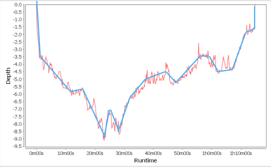
Data based in GPS reading like this often have a lot of "noise", or points that seem inconsistent with the general trend of the rest of the points. One way to deal with points like these is to think of them as outliers. Average rates of change should cut out the noise.
Eyeballing this. Mock-up level accuracy.
Lines of best fit like this reduce, or eliminate, the noise from GPS. From here, we can determine whether the diver exceeded the safe ascent speed.
To do this, we are going to look at many average rates of change.
slider to zero. Target to tangent. You seem to have a clear idea of what this feature will do. I can mock something up if you want, but it doesn't seem to the the highest priority in this chapter.
As we add more lines approximating the rate of change, the two points on the graph get closer together. When this distance gets very small, the average rate of change approximates instantaneous rate of change.
Move the line along the position graph to see how the instantaneous rate of change changes.
This line is called a
We can plot the slopes of the tangent lines on a new graph. Notice the x-axis is time since the start of the dive. The y-axis is diver's ascent and descent speeds.
This seems like it will work best with either more sliders, this time moving time along like scrubbing, or as an animation with actual scrubbing. Images are state mock-ups.
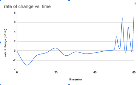
The position and speed graphs look very different but are generated from the same data. The position graph is most useful for knowing exactly how deep the diver is during any moment during the dive. The speed graph is most useful for knowing how well the diver regulated their decompression. The maximum y-value on the speed graph is about
Match the use/information with the appropriate graph
location in the pool
length of the race
race time
time of turn
when he got tired
speed during first length
speed during second length
slowest part of the race
relationship to other swimmers
position graph
velocity graph
The relations between these two graphs, really between the two functions represented by the graphs, is called a
Let's look at another application of derivatives.
Space Shuttle Discovery
Data from: https://www.nasa.gov/pdf/522588main_AP_ED_Phys_ShuttleLaunch.pdf
The Space Shuttle Discovery is one of the space shuttles in NASA's space shuttle program. Discovery alone launched and landed 39 times in about 27 years between 1984 and 2011. It's missions included both research and assembly missions for the International Space Station.
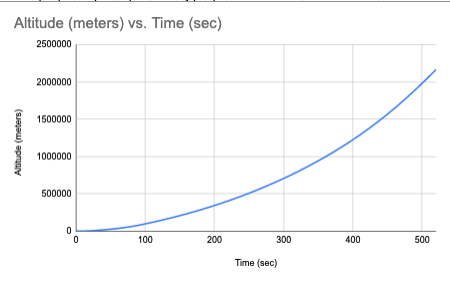
Space shuttle flights like the Discovery's are split into four phases: ascent, entry, orbit, and rendezvous. This is the altitude graph for the ascent phase of one of the Discovery's missions. The space shuttle needs to reach at least 7.85 kilometres per second in order to attain orbit. We will need the speed graph to determine if and when the Discovery reaches this speed.
Students use the same tangent tool as above to make the speed graph. Images below are state mock-ups.
The x-axis would be easier to read if gridlines were at the minute (e.g. 60, 120, etc).
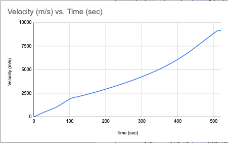
The Discovery does reach the required speed at about
In fact, the safety of the crew and equipment requires the shuttle's acceleration to stay under 29 meters per
We typically think of acceleration in terms of fast cars. Think "This Ferrari goes from 0 to 100 kilometres per hour in 2.4 seconds!" Acceleration is actually the derivative of speed. That means acceleration measures the change of speed during a certain time. Let's see how close to the safety limit of 29 meters per
Students use the same tangent tool as above to make the acceleration graph. The images are state mock-ups.
The x-axis would be easier to read if gridlines were at the minute (e.g. 60, 120, etc).
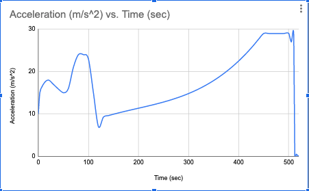
The maximum acceleration during this ascent phase is about
The ascent phase of the mission include several events between lift-off and reaching orbit. Small variations in the position and velocity graphs show as large jumps in the acceleration graph. Drag the events to their corresponding locations on the acceleration graph. Some events are single points on the graph and others are entire sections of the graph.
design cards for each line below
Space shuttle lift-off
Solid Rocket Booster separation
Main Engine Cutoff
Space Shuttle Main Engines provide smoothly changing acceleration
External Tank Separation
Negative rate of change of acceleration (large air drag)
Constant acceleration (3 g’s)
On orbit
From virus spread to diving decompression to space flights, the relationship between velocity and position stays constant. The velocity is the derivative of position. What position graphs show in steepness, velocity graphs show in coordinate points. Continue practicing visualising this relationship by matching the position graphs on the left to the velocity graphs on the right.
shuffle the cards below. Students match.
.png)
.png)
.png)
.png)
.png)
.png)
.png)
.png)
.png)
.png)
.png)