FunctionsGraphing and Interpreting Functions
The Olympics is full of incredible athletic feats. It’s also full of interesting data. Graphs help us visualize that data. During our time together today, we will watch Olympic competitions and analyse their graphs for interesting information. Let’s head over to the gymnastics arena!

Ri Se-gwang of the People’s Republic of Korea is about to vault. He won the gold medal for the vault in the 2016 Summer Olympic Games. Let’s watch.
There are several things going on here. Move the video back and forth to see how the graph lines up with the motion.
First, we need to understand is what the axes represent. The x-axis in this graph is the horizontal distance Ri travels throughout his vault. It is measured in centimeters. The y-axis is the vertical distance in centimeters Ri travels. This gives us information about Ri’s position much like chess pieces on a board.
The graph does not include any information about time. For example, we cannot tell when Ri landed on the pit. Some of the graphs of later events will include time along the horizontal axis.
On this graph, we see the vault is at (
Let’s build some intuition for what graphs of different events look like. Match the graph to the event. Be sure to pay close attention to what the axes represent.
| Triple Jump | 50 M Freestyle | 100 M Hurdles | Vault | Diving | Skiing |
|---|---|---|---|---|---|
| Graph | Graph | Graph | Graph | Graph | Graph |
 |  |  |  |  | |
| Video | Video | Video | Video | Video | Video |
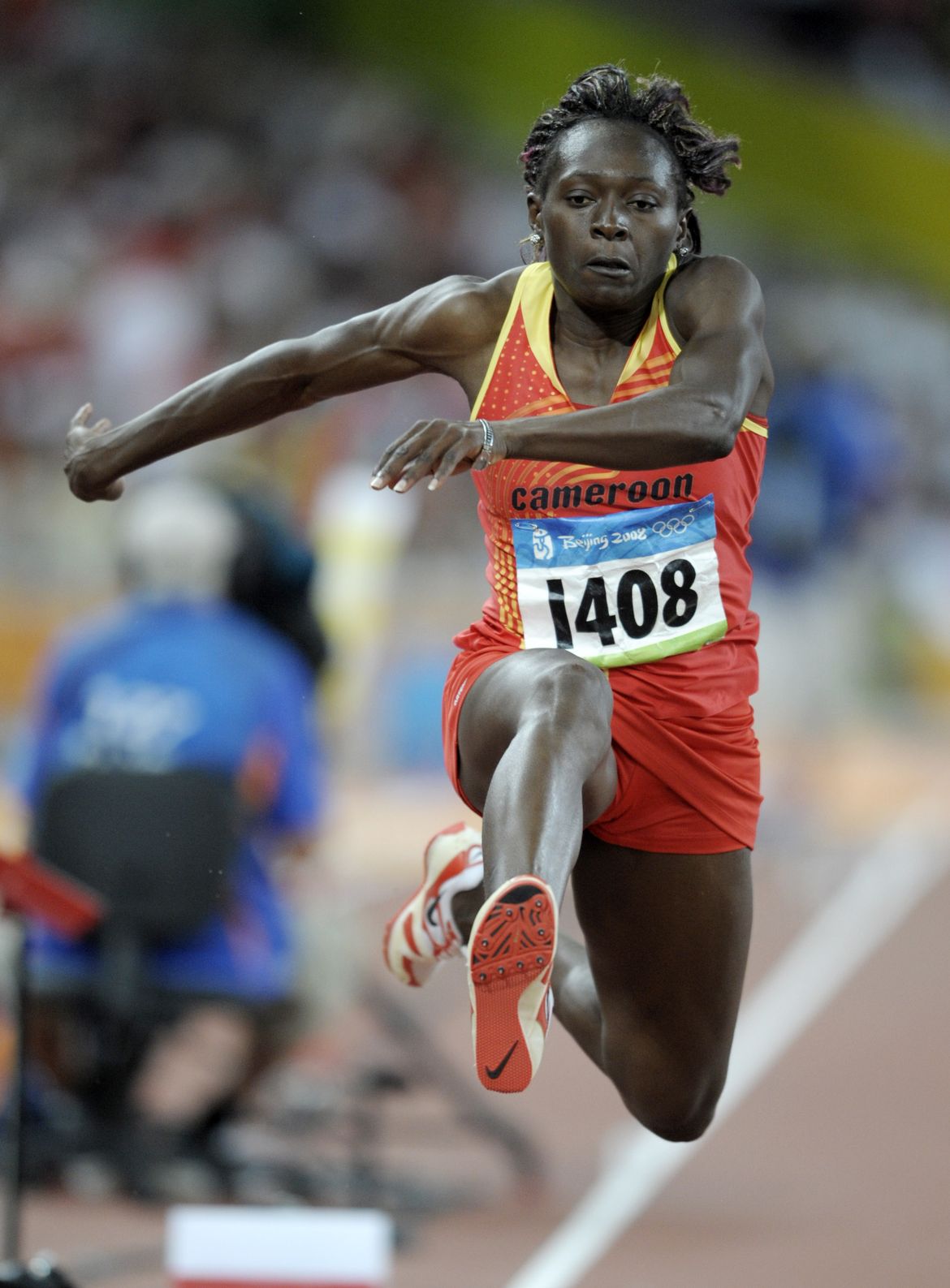
| Françoise Mbango Etone of Cameroon holds the Olympic record in women’s triple jump with a length of 15.39 meters. | César Cielo of Brazil holds the Olympic record for the men’s 50 meter with a time of 21.47 seconds. | Sally Pearson of Australia holds the Olympic record in the women’s 100 meter hurdles with a time of 12.35 seconds. | Ri Se-gwang of the People’s Republic of Korea won the gold medal for the vault in the 2016 Summer Olympic Games. | Ren Qian of China won the gold medal for diving in the 2016 Summer Olympic Games. | |
| Start: 985m | Finish: 805m | Vertical drop: 180m | Gates: 66 | Finish time: 48.33 |
As you can see there are several different perspectives for graphing motion. One perspective is distance as a function of time. Select the events represented with this perspective.
We see the other two events are
We are just in time for the men’s 50 meter freestyle finals. Keep a close eye on César Cielo Filho of Brazil. The graph of his swim will appear as the video plays.
César Cielo of Brazil holds the Olympic record for the men’s 50 meter with a time of 21.47 seconds.
What an emotional race for Cielo! He broke the world and olympic records with this swim. The graph shows Cielo’s record-breaking swim. The shape is one we have seen before in graphing linear functions. Recall this graph represents all the ordered pairs matching inputs to outputs. We can use information from the graph to write the function describing Cielo’s swim. Let’s call the function f(t).
Remember the general form for
This means we need to find
Notice the horizontal-axis, in this graph shows
We are only missing slope. In this function, slope represents Cielo’s
As we move from left to right along the line, the vertical distances measure
Recall that the
f(t)=
Let’s say we want to know how long it took Cielo to swim the first 10 meters. Ten meters into the race, This means we are looking at f(t)=10. The phrase “how long” indicates we are solving for t.
Cielo swims the first 10 meters in just over
Take a look at the top four finishers during this race:
| Swimmer | | Function Name | | Color | | :------ | | :------------ | | :---- | | Cesar Cielo Filho | | f(t) | | green | | Amaury Leveaux | | l(t) | | purple | | Alain Bernard | | b(t) | | blue | | Ashley Callus | | c(t) | | red |
All the lines cross the y-axis at
Say we want to figure out how many seconds Cielo is ahead of Leveaux after 10 meters. We already know Cielo swam this distance in 4.25 seconds. We don’t know the function rule for l(t), Leveaux’s swim, but we do have the graph. Find the time, t, where l(t) =
Leveaux swims the first 10 meters in
Leveaux and Bernard trained together, and it shows. They stay neck-in-neck the whole race. They finish only
Use the graph to find where everyone is at the 20 second mark. f(20)=
Callus is 6 meters behind
Let’s head over to the diving pool for the women’s 10 meter platform competition.
Meanwhile, on the other side of the Aquatics center, a diving competition is in progress. Ren Qian is among the youngest Olympic medalists. She is diving now - let’s watch
Ren Qian of China won the gold medal for diving in the 2016 Summer Olympic Games.
Let’s call the function representing Ren’s dive d(x). The input values, x, are horizontal distances from the platform. The output values, d(x), are Ren’s
Graphs with this shape are called cubic functions. We can get important information from the graph even without knowing the function equation. Match the given statements to the graph.
| Place contextual statement cards on graph | | Target key feature appears when card is placed | |Function notation appears when card is placed | | ![]() | |
| | ![]() | |
| | ![]() | | Ren’s takes her place on the platform. | | Vertical intercept | | | | Ren reaches the highest point of her dive. | | maximum | | | | Ren completes 3.5 somersaults. | | decreasing | | 0.335<x<2.556 | | Ren’s entry is nearly flawless. | | Horizontal intercept | | d(2.056)=0 | | Ren turns around under water. | | minimum | | d(2.556)=-1.623 | | Ren surfaces after a nearly flawless dive. | | Horizontal intercept | | d(2.989)=0|
| | Ren’s takes her place on the platform. | | Vertical intercept | | | | Ren reaches the highest point of her dive. | | maximum | | | | Ren completes 3.5 somersaults. | | decreasing | | 0.335<x<2.556 | | Ren’s entry is nearly flawless. | | Horizontal intercept | | d(2.056)=0 | | Ren turns around under water. | | minimum | | d(2.556)=-1.623 | | Ren surfaces after a nearly flawless dive. | | Horizontal intercept | | d(2.989)=0|
Recall the y-intercept is where x=
Similarly, the x-intercepts are were
When we talk about the maximum, we are really talking about the highest
The minimum is Ren’s lowest height. In this graph her lowest point is underwater. Because the x-axis represents the surface of the water, the minimum d(x) is
Intuitively, we understand that the graph is increasing when Ren’s body is moving
Ren moves up during the intervals:
0<x<0.335 0.335<x<2.556 2.556<x<2.989
The unchecked interval is where the graph is
Notice the
Let’s think about the input and output values for d(x). Recall
Ren’s horizontal distance starts at the diving platform and ends where she resurfaces in the pool. We know the diving platform is at x=
Recall
Similarly, the maximum d(x) gives us the upper bound on the range. Therefore, the range is
Let’s head to the beach for the gold medal men’s volleyball match between Brazil and Italy. The teams engage in a beautiful volley (5![]() 01). As you watch the video, notice the shape of the graph. Is it what you expect?
01). As you watch the video, notice the shape of the graph. Is it what you expect?
The graph shows the volley as a function of
For instance, the ball spends about
Notice that the graph does not show when the ball changes direction. This could happen if the graph were a function of
Creating Graphs
The women’s pole vault is just about to start. You will be drawing the graph for this event.
We like to start graphing using a table. Fill in the table below. Note the landing pad, called the pit, is 0.81 meters tall.
| Time (s) | | Height (m) | | ![]() | |
| | ![]() | | 0 | | 0 | | 1 | | 0 | | 4 | |
| | 0 | | 0 | | 1 | | 0 | | 4 | |
Plot these values on the coordinate plane.
This graph is interesting because between
Systems of Functions/ Simultaneous Functions
Let’s head over to the track for the women’s 800 meter final. Looks like we arrive in time to catch the last 200 meters of the race. 3![]() 00
00
| Athlete | | Adelle Tracey | | Laila Boufaarirane | | Raevyn Rogers | | ![]() | |
| | ![]() | |
| | ![]() | |
| | ![]() | | Country | | GBR | | FRA | | USA | | @ 90.63 s | | 600 | | 598 | | 590 | | @ 800 m | | 121 | | 126 | | 120.2 | | color | | black | | green | | orange | | function | | g(t)=6.58545x+3.16101 | | f(t)=5.71105x+80.4071 | | u(t)=7.10179x-53.6354 |
| | Country | | GBR | | FRA | | USA | | @ 90.63 s | | 600 | | 598 | | 590 | | @ 800 m | | 121 | | 126 | | 120.2 | | color | | black | | green | | orange | | function | | g(t)=6.58545x+3.16101 | | f(t)=5.71105x+80.4071 | | u(t)=7.10179x-53.6354 |
When we have two or more function on the same coordinate plane, we call them a
| Tracey and Rogers are at the same location. | | g(t) = u(t) | | Rogers is ahead of Boufaarirane. | | u(t) < f(t) | | Boufaarirane and Rogers are at the same location. | | f(t) = u(t) | | Tracey is behind Rogers. | | g(t) > u(t) |
The graphs intersect when one runner passes another. When the runners have about 200 meters left in their race,
Rogers passes Boufaarirane at about
About
The slopes of each function tell us each runner’s
Roger’s speed is
In this system of functions, we can see who is ahead at any given time during the race. For example, we write f(t) > u(t) when
| Students label with the given contextual statement cards. | | This information appears after the functions notation card is correctly placed. | | Extra information. Not cards. | | ![]() | |
| | ![]() | |
| | ![]() | | Boufaarirane is ahead of Rogers. | | f(t) > u(t) | | 90.63=<t<96.382 | | Rogers is ahead of Boufaarirane. | | f(t) < u(t) | | 96.382<t<=120.2 | | Tracey is ahead of Rogers. | | u(t) < g(t) | | 90.63<=t<109.998 | | Tracey is ahead of Boufaarirane. | | g(t) > f(t) | | | | Rogers is ahead of Tracey. | | g(t) < u(t) | | 109.998<t<=120.2 |
| | Boufaarirane is ahead of Rogers. | | f(t) > u(t) | | 90.63=<t<96.382 | | Rogers is ahead of Boufaarirane. | | f(t) < u(t) | | 96.382<t<=120.2 | | Tracey is ahead of Rogers. | | u(t) < g(t) | | 90.63<=t<109.998 | | Tracey is ahead of Boufaarirane. | | g(t) > f(t) | | | | Rogers is ahead of Tracey. | | g(t) < u(t) | | 109.998<t<=120.2 |
When we talk about one function being greater than another, we are using the
Looking at the three functions on the coordinate plane, we can see that the relationship between u(t) and g(t) changes from g(t)>u(t) to u(t)>g(t) when
Finally, here is one more function that represents a sport. Can you think of what it is, and write a short story that explains the different features of the chart?
TODO: draw chart << free-form text input >>